A UX Case Study | Design for Dignity
Banking App for Seniors


How might we help seniors become more proficient with the banking app without overwhelming them
while ensuring their specific needs are taken into account?


PROJECT TYPE
UX Design, Mobile UI Design
Service Design
MY ROLE
User Research,
Wireframing & Prototyping
TEAM
Tiffany Nguyen, Sohee Kang
TOOLS
Figma, Miro,
Adobe Photoshop
TIMELINE
Oct 2023 - Nov 2023
(5 Weeks)
Overview | Design x Dignity

Financial management often falls among seniors' top concerns
(Source: Grow with Google)
It was only a matter of time before seniors made their presence known in the digital landscape. Research has shown a significant rise in mobile adoption among seniors. These digital seniors go online for various reasons, with organizing their finances (87%) being one of their top concerns.
While banking apps have become indispensable for their convenience and operational efficiencies, they often fall short of meeting the needs of senior citizens and those who are not tech-savvy. Therefore, our goal is to deliver a thoughtful, user-centric app design that can enhance the onboarding process. By providing a faster and more intuitive experience, we aim to meet the audience where they are, ensuring that seniors get the support they need to achieve digital literacy.
Balancing usability, trust, and visual clarity in a high-stakes domain like finance. This design intervention could open a new market opportunity for financial services. By catering to seniors' unique needs, banks can foster greater customer loyalty and satisfaction while centralizing their focus on digital banking services. This reduces operational costs and enhances financial inclusion, contributing to the overall growth and sustainability of the business.
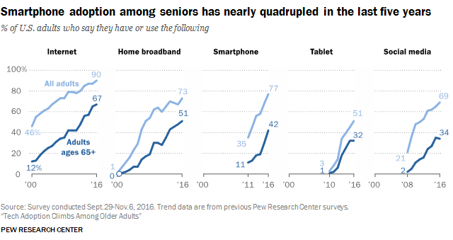
Increasing smartphone adoption among seniors
(Source: Pew Research Center)
Preview | Our Design Suggestions
From here, we established three guiding principles for my redesign: Make it understandable, calming, and action-oriented.
Simple but enough Visible
Existing UIs are often cluttered with information and shortcuts. Our "Easy Mode" aims to reduce the number of options on each screen and includes more labels to explain actions as users navigate.
Easy Mode for Beginner
Instead of replacing the existing UI system, we’ll introduce the Easy Mode toggle. This button allows users to focus on key layout of the app, reducing cognitive load during onboarding, and enabling them to learn the interface at their own pace.
Tailored | On-demand training topics
Our goal is to design training content on commonly searched topics, tailored to our users' needs (such as sending money, cashing checks, and starting savings accounts). We keep our design clean and simple - making it easier for seniors to swipe and select the preferences.
Originally made for older adults, we recognize that these tools can also be helpful for a broader scope of users.


Introducing Learning Tab
🎯 Step-by-step instructions
⏱️ Allow user to learn at their own pace
🚶♀️ Review and practice at any time
🔆 Simple & Engaging interface

Simplified | Step-by-step instructions
Breaking tasks into smaller steps helps seniors focus on one task at a time, making it easier to grasp information and reduce cognitive strain. New users are guided with onscreen pop-ups to learn how to navigate through screens.
Flexibility | Re-visit any time
Users can practice and improve their skills in these subjects at their own pace and based on their own interests by accessing the learning mode anytime from the home screen.
Understandable: Simplify language and organize hierarchy.
Action-oriented: Bring important tasks like transfers, savings goals, and insights to the surface.
Calming: Use visual design to reduce cognitive load and build trust.

Engage | Content and Interactions
Gamification motivates users to better engage with the app. We offer a small mission after each guideline to help reinforce their learning. Our ultimate goal is to give them the ability and confidence to finish tasks on their own.

Behind the Scene | Our Design Process
CLICK TO VIEW IMAGEUnderstand | Pain points
We conducted some interviews focusing on both novice and frequent users to identify their specific needs and challenges with the current banking app.
I often turn to family members for help with banking online services.
- Geogre T., 69, MA Resident
Having someone or a resource to guide me through those initial steps would be really helpful.
- Ming X., 78, MA Resident
Most apps were cluttered, filled with jargon, and lacked intuitive cues, especially for senior users like my uncle who just starting to use phone to manage his finance.
- 23, Student
Users want more context, not just numbers
They often feel anxious navigating through screens / don’t know how to undo
They rarely use budgeting features because they’re buried or confusing.
Research | Audience & The Ecosystem
CLICK TO VIEW IMAGEWe want to thoroughly understand the senior’s issue with technology and identify any environmental factors that might influence their decision-making process. The concept map is centered around the theme of dignity, one of our primary objectives. On the left side, we emphasize three key enablers that potentially affect dignity: Human Rights, Merit, and Autonomy. The final focus areas and corresponding connections are highlighted below.
Define | User Problem & Persona
Our main focus is the senior population who
Are not tech-savvy
Are uncomfortable with continuous digital interface updates
Struggle to find their specific needs in the app
May have some physical limitations
Problem Statement
Harold is a retired factory worker
who wants to learn how to manage his financial via his phone app
since he has limited experience with technical devices
CLICK TO VIEW IMAGEDefine | Problem Statement
How might we help seniors become more proficient with the banking app without overwhelming them while ensuring their specific needs are tailored?
Our observations, interviews, and literature review suggest that existing banking apps frequently overlook this user segment, potentially affecting their dignity as users. The current feedback often times are characterized by:
Technical Literacy Gap
Seniors struggle with the app due to limited tech skills.
Our Focus
Accessibility Barriers
Seniors with physical limitations sometimes face usability challenges.
Discomfort with Updates
Continuous changes cause unease among seniors.
Information Retrieval Issues
Finding specific features can be challenging, impacting the overall user experience.
Additionally, the decline in branch density, driven by technology investment and the rise of digital banking, exacerbates the issue. Seniors may need to travel long distances to access services, creating a significant hurdle unless they can bridge the digital divide. These insights helped us form personas and identify three core user needs: transparency, emotional reassurance, and decision-making support.
WHAT INSPIRED OUR PROJECT
The concept of Digital financial inclusion - uses cost-effective digital methods to provide formal financial services to excluded and underserved people, ensuring accessibility and sustainability for both customers and providers.
Ideate | Research & Brainstorming
Affinity Mapping
We conducted brainstorming sessions to categorize and narrow down our focus areas. Given our three-week timeframe and the initial goal of promoting user dignity, we decided to delve deeper into interactive practices, switching modes, and the potential integration of AI assistants.
Concept Maps
Three possible interventions
After identifying emerging themes, we developed three ideas to improve the usability of digital banking apps for seniors:
(1) Onboarding Practice Mode (2) Switchable UI (3) AI-powered consultancy.
We later chose to focus primarily on the onboarding process, as it emphasizes learning and significantly enhances the overall user experience.
CLICK TO VIEWTutorial and Onboarding (Elaborated)
Develop a user-friendly onboarding process that introduces users to the app’s basic features. Include interactive tutorials and practice modes (gamifications) to help seniors become familiar with using the app.
Customer Journey Map

current iterationThree possible interventions
After identifying emerging themes, we developed three ideas to improve the usability of digital banking apps for seniors:
(1) Onboarding Practice Mode (2) Switchable UI (3) AI-powered consultancy.
We later chose to focus primarily on the onboarding process, as it emphasizes learning and significantly enhances the overall user experience.
Empathize | Story Board
CLICK TO VIEW IMAGECLICK TO VIEW IMAGECLICK TO VIEW IMAGEEmpathize | Identifying the opportunities & limitations
OPPORTUNITIES
Effective onboarding strategies
Prevailing issue
Increasing demands
FEASIBILITY
Easy Implementations
Scalable and applicable across banks
LIMITATIONS
Need clear goals and endorse engagement
Environmental factors
(E.g: Inconsistent Internet Access, Cognitive Limitations, etc.)
Design | Revamping the product
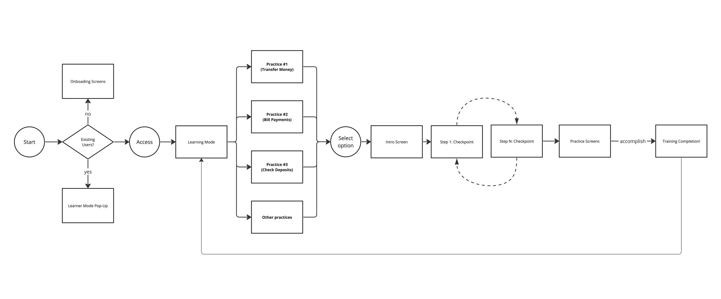
User-Flow Diagram
Wireframes | Lo-fi
The low-fi wireframes were vital in improving our sketches before the high-fi mockups. They helped identify key design elements and gather initial feedback from the team. This saved time before diving into the complex visual design phase.
Design System | Redesigning the component base
We built on the foundation of the existing CHASE BANK guidelines and constructed a new component set that would allow us to simplify the design version.
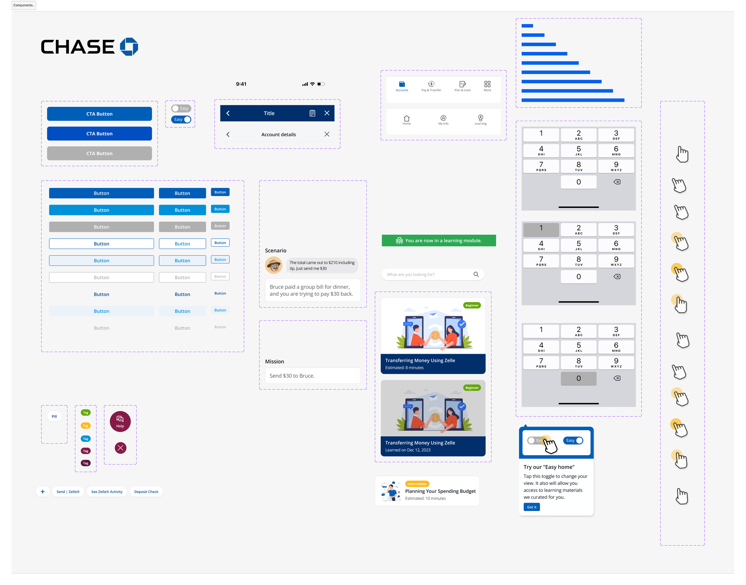
New Design Components


CHASE Design Guideline (Source)
Prototype | Interactive (Figma)

Testing | Usability and Think-aloud
We created a mid-fidelity prototype in Figma and conducted usability tests with five participants. The feedback on the design direction has been positive — users especially appreciated the well-informed navigation and the ability to switch between modes.
One key piece of feedback was the need for clear visual cues, such as animations and a progress bar—elements we plan to incorporate in the next design iteration.
Design Iteration | Reflection & Takeaways
Understanding the user is key
User research, journey mapping, and role-playing are powerful tools to help us grasp the essence of the needs of this population.
Later on, we can narrow down the features for the first version by identifying their specific goals for using the product.
Accomplishing time-boxed goals
Setting goals, careful planning, and keeping up with specific timelines were our teamwork accomplishments. It helped us complete our deliverables within the 5-week window for our Design for Dignity class.
Continuous iterations
We acknowledge that this design is part of an iterative process. Hence, after implementing our first prototype, we aim to continue refining this deliverable through multiple rounds of user testing to assess its effectiveness and identify any in-depth caveats.
Things we haven't fully covered include:
• Accessibility (will conduct in-depth research.)
• Sketching alternative ideas and variants.
• Design decisions across the app.
• Elaborated user testing.
• Prototypes for multiple platforms.
Last but not least, this project reminded me that designing for trust is as much about emotional design as it is about functionality. Small things like tone of voice & microscopy, visual alerts, and clear actions — made users feel empowered, not overwhelmed.