
COVID-19 Pandemic National Data Dashboard
ROLES
Product Lead, Front-end Engineer, Researcher
STAKEHOLDERS
Vietnam Health Ministry・VNCDC
Due to confidentiality requirements, I am unable to share the full details of this project.
Throughout this two-year initiative, I gained significant experience as a Project Lead and in Data Visualization, contributing to the development of this quick-response national project. I oversaw the development of this webapp, focusing on data dashboard deliverables and improving accessibility to critical information.
This project aimed to support scientists and researchers in disease control efforts. Initially launched for internal study purposes, the website was made publicly accessible in December 2020, attracting 170,000 visitors by December 2021. To further enhance data encryption and safeguard patient privacy, it was later taken offline for maintenance.
Below is a high-level overview of my project’s overview and accomplishments.
Overview | Our vision
PROBLEM STATEMENT
During the early stages of the 2nd wave COVID-19 pandemic in Vietnam, the country was grappling with a limited number of cases, numbering around 100. Our approach to tracking individuals at the time involved manual processes using Excel spreadsheets. Although manageable, this method was time-consuming and limited in the information it provided.
FOCUS
Transforming public health data into actionable insights for decision-making. This project involved designing and prototyping a comprehensive dashboard for Vietnam's CDC during the COVID-19 pandemic. The dashboard integrated real-time data to help public health officials monitor case trends, allocate resources effectively, and communicate updates to the public.
SOLUTION
Recognizing the importance of utilizing this data in the fight against COVID-19, I developed a plan to visualize the information collected by our field team. This effort aimed to enhance our understanding of the situation and inform more effective decision-making.

Highlight | COVID-19 Transmission and Interconnection Graph
This visualization maps the transmission and interconnections of COVID-19 among confirmed patients. Leveraging anonymized data, the graph enables efficient tracing of the virus's spread by identifying and localizing clusters. This tool played a critical role in enhancing understanding and response efforts during the pandemic, offering clear insights into transmission patterns and potential spread pathways.
Built using amCharts, the dashboard processed over 110,000 data points, transforming them into actionable insights. As a result, it accelerated decision-making speed by 150% for over 10 key stakeholders involved in disease control initiatives.
UI Layout | Homepage Shortcuts

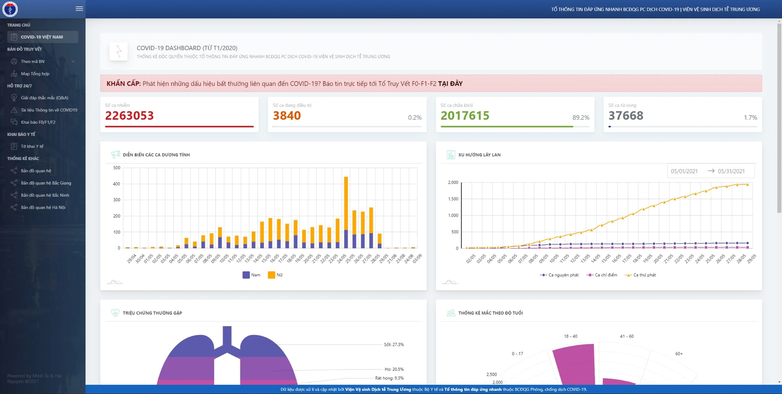
This main page provides a comprehensive and interactive overview of critical pandemic-related data. Designed for live updates and rapid information access, the UI layout prioritizes clarity and immediate comprehension.
When designing the dashboard, each visual element was crafted to ensure high visibility and the ability to quickly identify emerging patterns. The language and reports’ order were initially tailored specifically for scientists and researchers, enabling them to glean insights with minimal additional explanation. That said, the main page itself also conveys key aspects of the situation at a glance, ensuring usability across different stakeholders.
With strong analytics and visual deliverables, this tool empowers our senior members to gain deeper insights into the 2nd and 3rd spread, support more informed decisions on controlling the disease.

A Zoom-out | Regional to National Scale
The map visualizes the spread of COVID-19 across cities and provinces, providing a clear geographic representation of the data. Over a three-month period, our data collection rapidly expanded to over 110,000 data points. To manage this influx, I developed a solution in close collaboration with the front-end, back-end, and data teams.
For the front end, we selected amCharts due to its robust library, seamless integration with React, and its flexibility to customize visualizations with interactive features. On the back end, the team implemented API data encryption, anonymization, and integrated the Google Sheets API to ensure smooth updates from the research team.
After three months of continuous improvisations, the web app solution was fully launched and led to a 150% improvement in decision-making speed for 10+ stakeholders involved in disease control initiatives, enabling more efficient and informed responses to the pandemic.
Summary | Key Takeaways
Understand Your Audience
Tailoring your design and solution to meet the specific needs of your target users—in this case, scientists and researchers—ensures that your product provides maximum value and usability in high-pressure environments.
Choose the right tech stack
At that time, selecting a robust tech stack, like amCharts for interactive visualizations and React for powerful integration, is essential for creating flexible, adaptable solutions that scale and adjust as requirements evolve in dynamic situations.
Ethics in Data Analysis
When handling sensitive census data—like civilian information—data encryption must be a top priority to safeguard privacy, ensure compliance with public health standards, and maintain user trust.