Northeastern University Health & Wellness Lab

Patient Centered Healthcare Portal

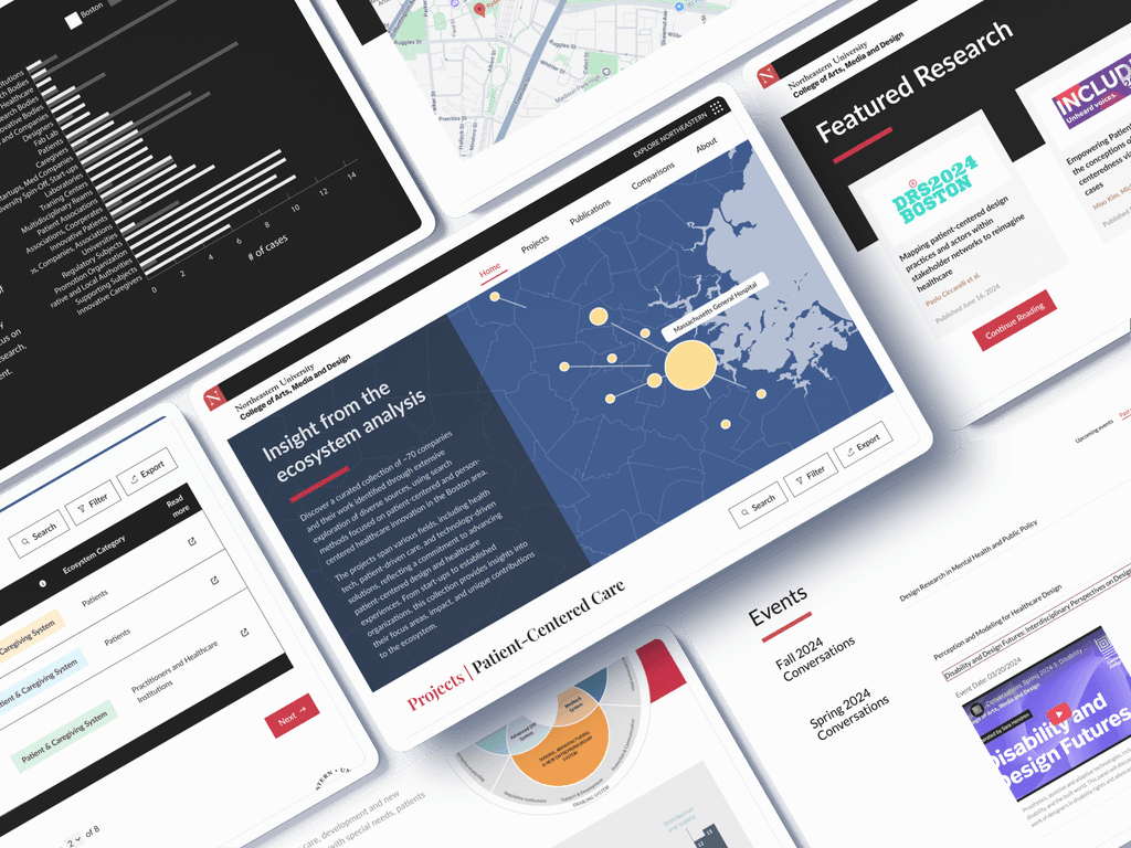
The Patient-Centered Design Platform addressed a critical gap in the U.S. healthcare system: essential resources and best practices were often scattered across institutions, limiting knowledge sharing, collaboration, and training for healthcare professionals and researchers.

In partnership with Politecnico di Milano, Northeastern's Center for Design aimed to centralize this knowledge into an intuitive, research-driven platform that empowers users to access resources and accelerates collaboration among clinicians, researchers, and designers, starting with Greater Boston area.

Timeline

10/01/2024 - 09/01/2025

Tools

Figma

React, Tailwind, AWS

Web Perfomance Tools

Team

1 Product Designer
4 Researchers
1 SWE
1 QA Tester
2 Marketing & Accessibility

Why we need a patient-centered care research portal?

Healthcare systems worldwide are striving to deliver care that is not only clinically effective but also genuinely responsive to patients’ needs. Yet, despite advances in technology, research indicates that 60% of patients feel their emotional needs are not adequately addressed in care delivery (Forbes Survey), revealing a critical gap in both the provider and patient experience.

Our research team established a dedicated effort to analyze these gaps within the current U.S. healthcare system, while fostering cross-country collaboration to build a centralized information hub. This website serves as the public-facing platform for that outreach initiative, with a current focus on the Greater Boston area.

Systemic Challenges

  • Fragmented data systems

  • Inconsistent care models & protocols

  • Geographical disparities in research & data collection

Systemic Challenges

  • Fragmented data systems

  • Inconsistent care models & protocols

  • Geographical disparities in research & data collection

Systemic Challenges

  • Fragmented data systems

  • Inconsistent care models & protocols

  • Geographical disparities in research & data collection

User Problems

  • Stress on time and capacity/cognitive load

  • Difficulty finding trusted resources

  • Limited collaboration opportunities

User Problems

  • Stress on time and capacity/cognitive load

  • Difficulty finding trusted resources

  • Limited collaboration opportunities

User Problems

  • Stress on time and capacity/cognitive load

  • Difficulty finding trusted resources

  • Limited collaboration opportunities

Objectives

  • Easy access to centralized patient-centered care resources.

  • Stay updated on the latest studies and service models

  • Share collaboration to advance patient-centered care.

Objectives

  • Easy access to centralized patient-centered care resources.

  • Stay updated on the latest studies and service models

  • Share collaboration to advance patient-centered care.

Objectives

  • Easy access to centralized patient-centered care resources.

  • Stay updated on the latest studies and service models

  • Share collaboration to advance patient-centered care.

Research Insights

We started with interviews to capture users’ needs and pain points, focusing on how they search for information, understand jargon, and organize key categories. Then, we used ethnography to validate our userflows, uncover hidden challenges, and ensure the platform delivers the right information to meet those practical needs.

🗂️ Siloed data and system fragmentation

🔍 Inefficient resource discoverability

🤝 Limited collaboration and knowledge exchange

Design Interations

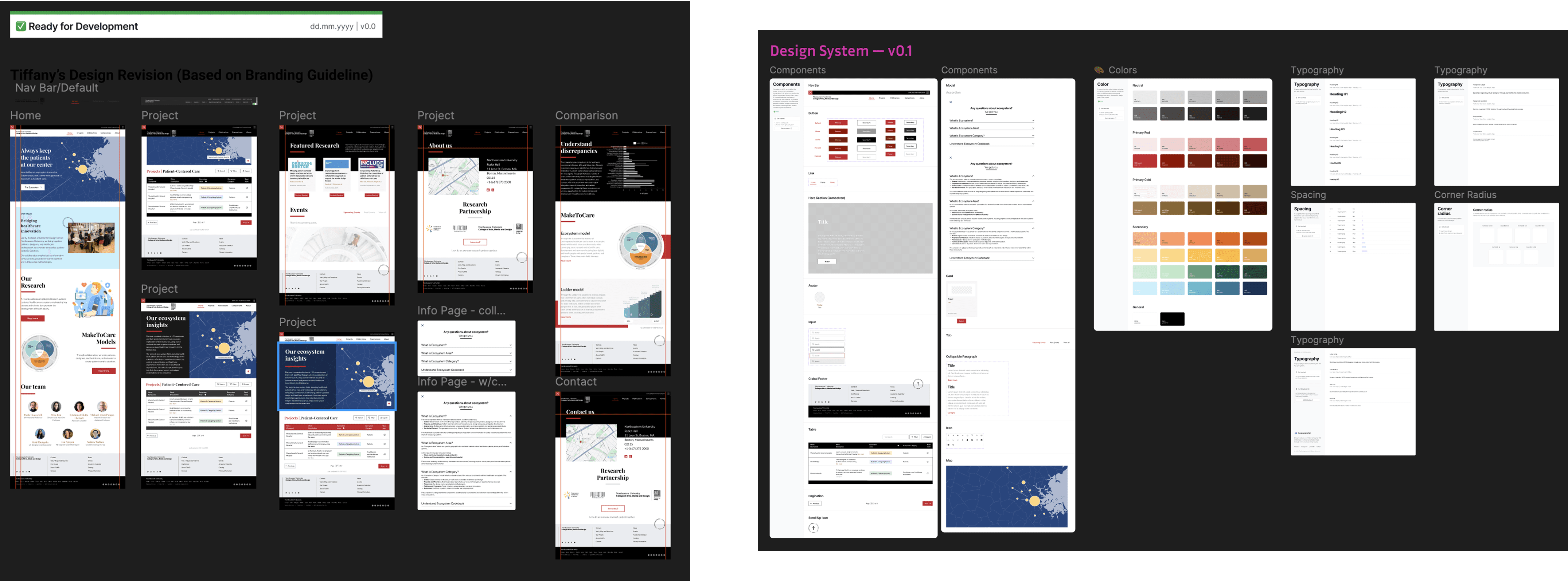
Through design workshops, we began building the information architecture by identifying key themes and user flows for our target users. We then created 10+ versions of lo-fi wireframes and 5 hi-fi wireframes, keeping clarity, usability, and accessibility as our top priorities.
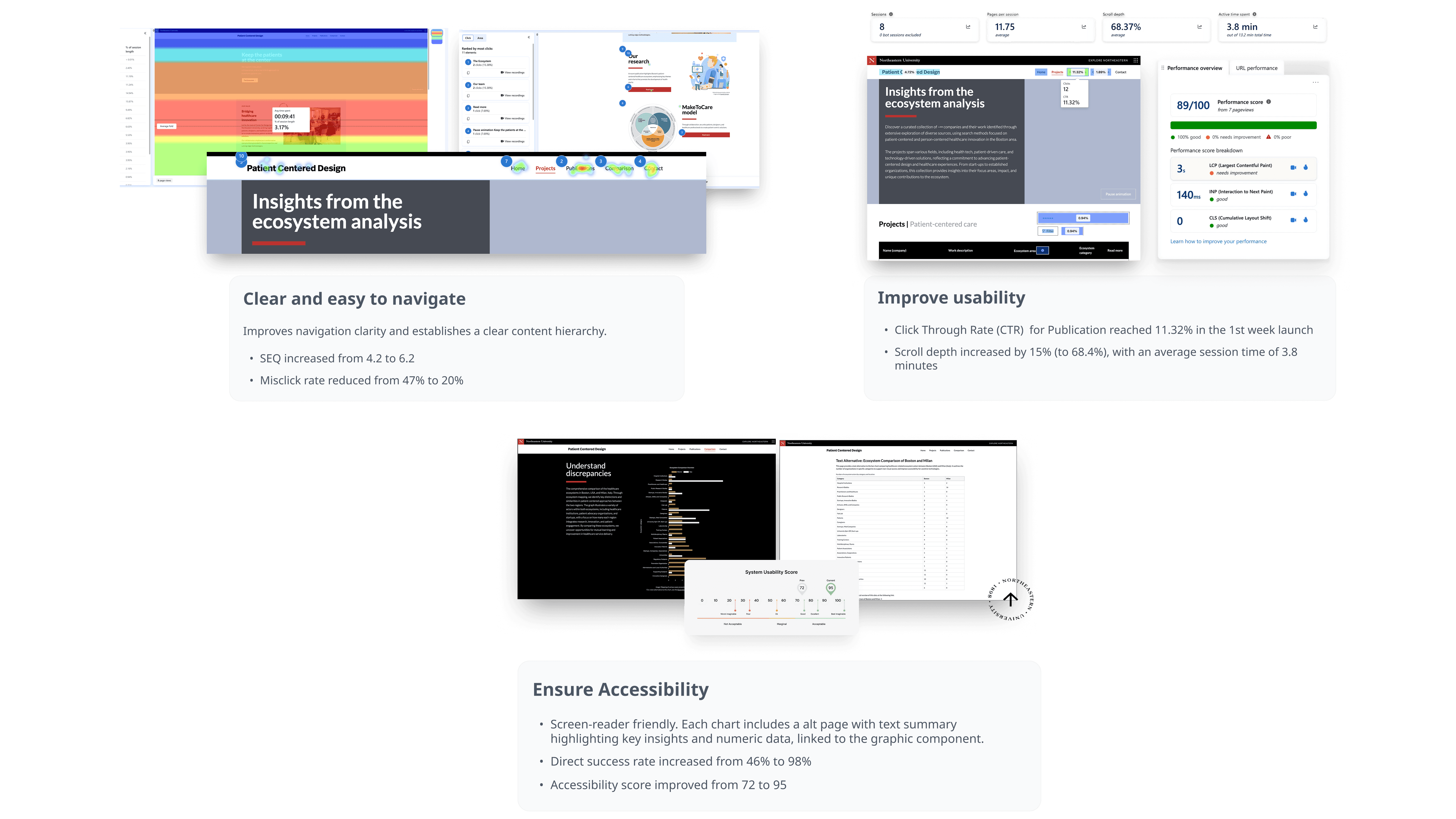
Design Iterations

Version 1
Product Layout

PROS
✅  Users can browse a wide range of actor categories at a glance
BUT
Scalability concerns
Diving deeper into each section adds cognitive load and navigation risk
Cannot clearly show correlations between related categories
Design Iterations

Version 1
Product Layout

PROS
✅  Users can browse a wide range of actor categories at a glance
BUT
Scalability concerns
Diving deeper into each section adds cognitive load and navigation risk
Cannot clearly show correlations between related categories
Design Iterations

Version 1
Product Layout

PROS
✅  Users can browse a wide range of actor categories at a glance
BUT
Scalability concerns
Diving deeper into each section adds cognitive load and navigation risk
Cannot clearly show correlations between related categories
Design Iterations

Version 2
Data Visualization and Terminology

PROS

✅ Simplifies complex data at a glance

✅ Gives an overview of the library and trends

BUT

❌ If not built with clear intentions, additional graphs can confuse users and fail to establish a connection between textual content and visuals.

Design Iterations

Version 3
Connecting Key Components

✅  Since introducing the knowledge repository and research models is our primary goal, I decided to use a geo-network graph to connect and represent all data points, giving users a clear overview of the knowledge repository and research models. Each node also includes a screen-reader-friendly alt page for enhanced accessibility.

✅ Following WCAG 2.1 guidelines, I ensured ARIA labels and tags were implemented during development, fully tested color contrast (AA standard), made the design color-blind friendly, and displayed sufficient items per table page for readability.

Validation

To validate the design proposal, we conducted a 3-week usability test with the internal team, followed by 3 evaluations from the web accessibility team and 2 branding compliance review.

Result

Lemro Upsim

Impacts

Lemro Upsim

Retrospective

In this project, I worked across multiple areas, from conducting user research and facilitating design workshops to prototyping and user testing, while collaborating closely with teams and departments. I also managed to keep design workflows, documentation, and testing organized within cross-institutional repositories.

Heading Out?

Appreciate you stopping by! Don't be a stranger, let's stay in touch.

Heading Out?

Appreciate you stopping by! Don't be a stranger, let's stay in touch.

Heading Out?

Appreciate you stopping by! Don't be a stranger, let's stay in touch.