CHASE Mobile® for Seniors
Have you ever felt frustrated trying to use an app that everyone else seems to understand, except you?
Timeline
Oct 2023 - Nov 2023 (5 weeks)
Tools
Figma
Miro
Adobe Photoshop
Team
Tiffany Nguyen
Sohee Kang

While mobile banking has become deeply embedded in everyday financial life, older adults remain a disproportionately underserved segment.
Despite significant growth in smartphone ownership, around 42% of U.S. adults 65+ now own a smartphone, up from just 18% a few years ago. (Source: Pew Research Center). This highlights both a usability gap and a significant opportunity. While they are one of the fastest-growing groups of digital banking users, their needs for clarity, guidance, and accessibility are often overlooked.
This project reimagines CHASE Mobile® experience to empower seniors with the autonomy, confidence, and security they need to manage their finances independently and without worry.
Our approach centers on designing with dignity and accessibility as core principles, not afterthoughts. We conducted moderated user research sessions with older adults, followed by iterative usability testing to validate our direction. This research revealed critical gaps in how seniors interact with financial apps, and more importantly, why current designs fail them.
Three guiding principles emerged from our work:
Clarity: Simplify language, organize content hierarchy, and reduce cognitive load.
Usability: Prioritize key tasks such as transfers, savings goals, and account insights.
Accessibility: Incorporate visual and audio cues to support navigation and boost app engagement.


Define
Audience & The Ecosystem
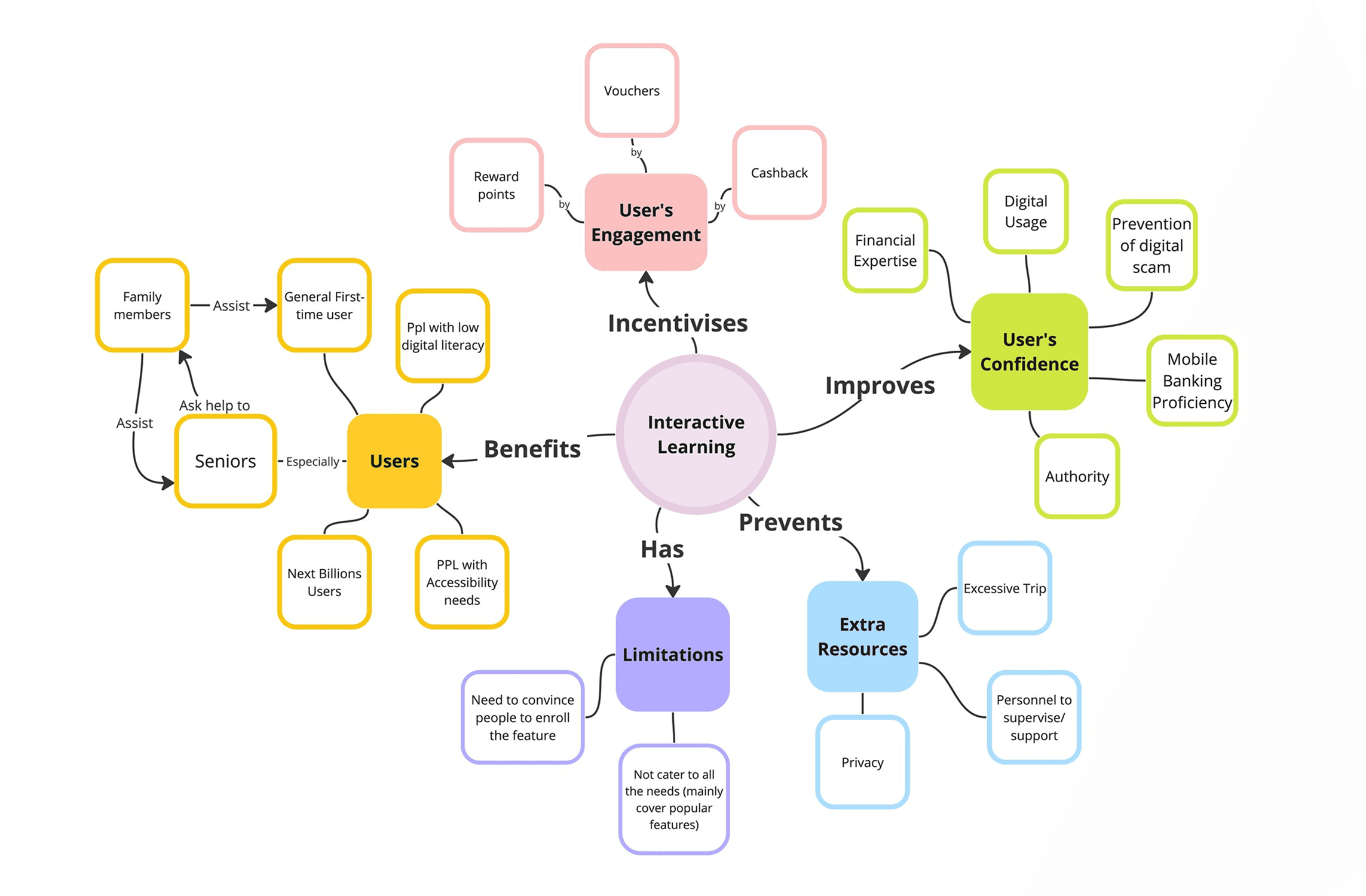
We want to thoroughly understand the senior’s issue with technology and identify any environmental factors that might influence their decision-making process. The concept map is centered around the theme of dignity, one of our primary objectives. On the left side, we emphasize three key enablers that potentially affect dignity: Human Rights, Merit, and Autonomy. The final focus areas and corresponding connections are highlighted below.
Opportunities & Limitations
OPPORTUNITIES
Effective onboarding strategies
Prevailing issue
Increasing demands
FEASIBILITY
Easy Implementations
Scalable and applicable across banks
LIMITATIONS
Need clear goals and endorse engagement
Environmental factors
(E.g: Inconsistent Internet Access, Cognitive Limitations, etc.)
User Problem & Persona
Our main focus is the senior population who
Are not tech-savvy
Are uncomfortable with continuous digital interface updates
Struggle to find their specific needs in the app
May have some physical limitations
Harold is a retired factory worker who wants to learn how to manage his financial via his phone app since he has limited experience with technical devices
Problem Statement
Our observations, interviews, and literature review suggest that existing banking apps frequently overlook this user segment, potentially affecting their dignity as users.
How might we help seniors become more proficient with the banking app without overwhelming them while ensuring their specific needs are tailored?
Additionally, the decline in branch density, driven by technology investment and the rise of digital banking, exacerbates the issue. Seniors may need to travel long distances to access services, creating a significant hurdle unless they can bridge the digital divide. These insights helped us form personas and identify three core user needs: transparency, emotional reassurance, and decision-making support.
WHAT INSPIRED OUR PROJECT
The concept of Digital financial inclusion - uses cost-effective digital methods to provide formal financial services to excluded and underserved people, ensuring accessibility and sustainability for both customers and providers.
Ideate
Research & Brainstorming
We conducted brainstorming sessions to categorize and narrow down our focus areas. Given our three-week timeframe and the initial goal of promoting user dignity, we decided to delve deeper into interactive practices, switching modes, and the potential integration of AI assistants.
Concept Maps
Three possible interventions
After identifying emerging themes, we developed three ideas to improve the usability of digital banking apps for seniors:
(1) Onboarding Practice Mode (2) Switchable UI (3) AI-powered consultancy.
We later chose to focus primarily on the onboarding process, as it emphasizes learning and significantly enhances the overall user experience.

Tutorial and Onboarding (Selected)
Develop a user-friendly onboarding process that introduces users to the app’s basic features. Include interactive tutorials and practice modes (gamifications) to help seniors become familiar with using the app.
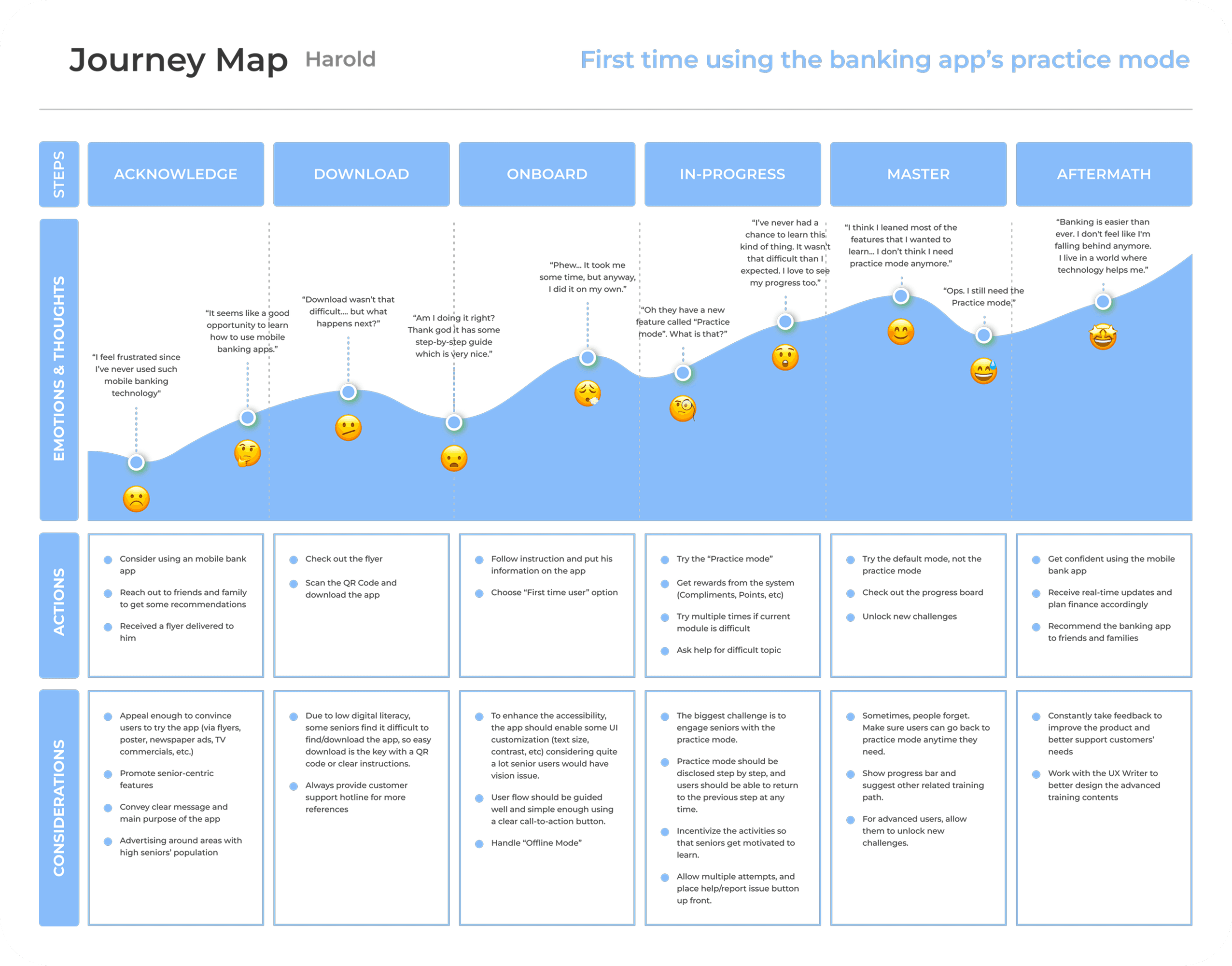
Customer Journey Map
Three possible interventions
After identifying emerging themes, we developed three ideas to improve the usability of digital banking apps for seniors:
(1) Onboarding Practice Mode (2) Switchable UI (3) AI-powered consultancy.
We later chose to focus primarily on the onboarding process, as it emphasizes learning and significantly enhances the overall user experience.
Prototype
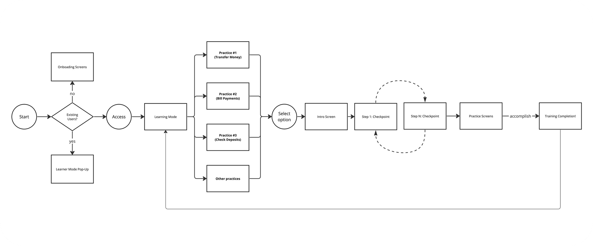
User-Flow Diagram
Lo-fi Wireframe
The low-fi wireframes were vital in improving our sketches before the high-fi mockups. They helped identify key design elements and gather initial feedback from the team. This saved time before diving into the complex visual design phase.
Design System
We built on the foundation of the existing CHASE BANK guidelines and constructed a new component set that would allow us to simplify the design version.
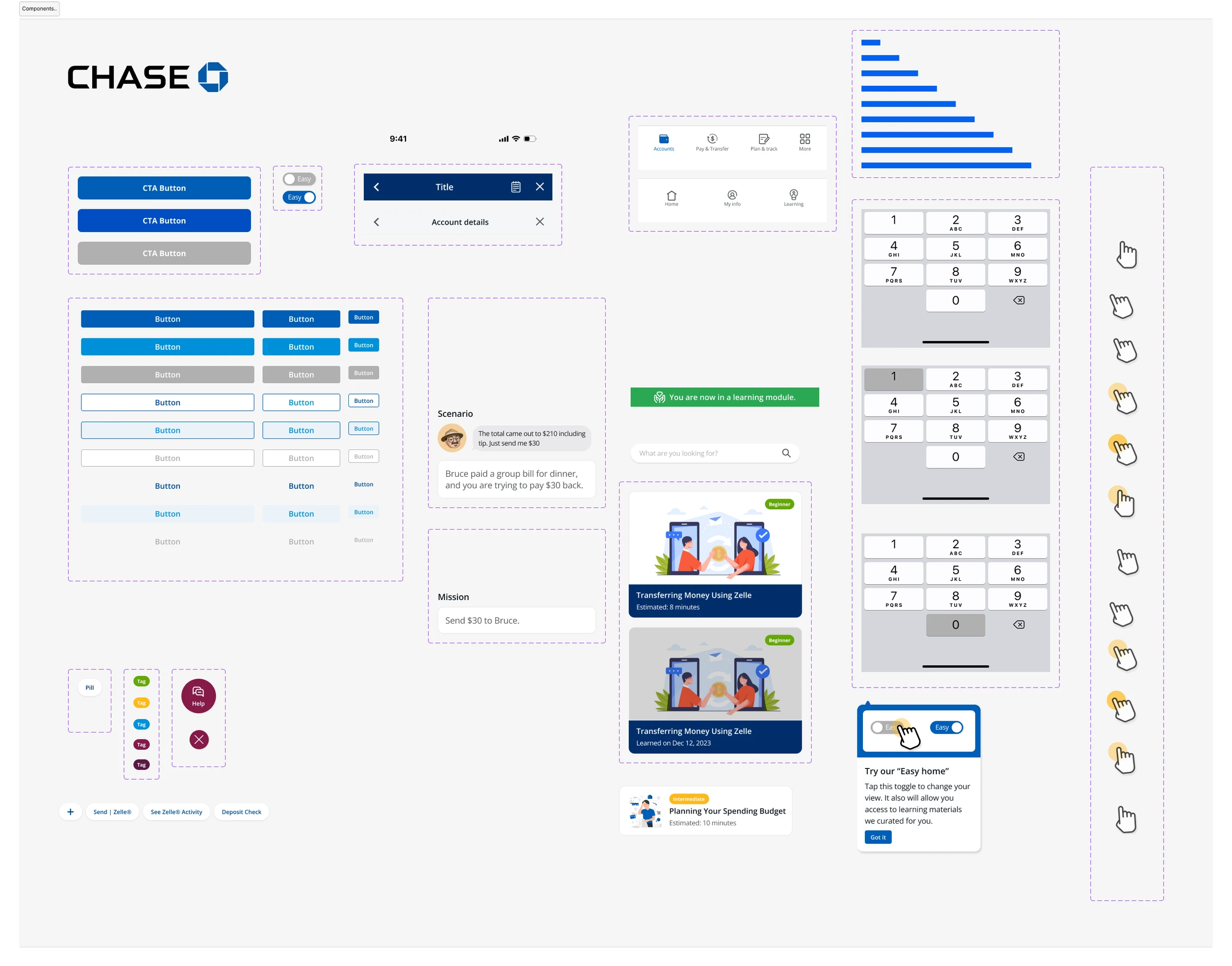
Additional resource: CHASE Design Guideline
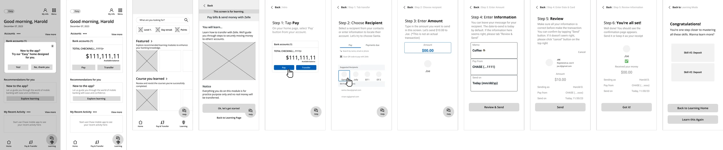
Prototype
Test
Usability and Think-aloud
We created a mid-fidelity prototype in Figma and conducted usability tests with five participants. The feedback on the design direction has been positive — users especially appreciated the well-informed navigation and the ability to switch between modes.
One key piece of feedback was the need for clear visual cues, such as animations and a progress bar—elements we plan to incorporate in the next design iteration.
Reflection & Takeaways
Understanding the User Through moderated research with 8 older adults (50+) and iterative testing, we focused not on our design solution, but on the why (Why some seniors decided not to use banking apps?). This uncovered a critical insight: seniors don't just need simpler apps, they need trustworthy ones. This distinction guided our design decision, allowing us to promote accessibility while maintaining brand compliance.
Designing for Trust Over Simplicity Trust is built through details. Tone of voice, visual clarity, confirmation patterns, and obvious actions made users feel empowered. Some microscopy interactions (eg: legible text, confirmation messages before transfers, larger touch targets) show significant differences in how seniors approached the app. These UI updates were the trust-builders.
Iterative Validation Our 4-week timeline required rapid iteration. Each testing round revealed deeper insights about seniors' mental models and assumptions. We're continuing this process post-launch to refine based on real usage patterns and ensure our mobile design aligns with accessibility guidelines.
What We'd Approach Differently
Earlier exploration of design variants to test competing approaches
More extensive platform-specific prototyping (mobile vs. tablet interactions differ significantly for this audience)
Deeper longitudinal testing to understand sustained adoption patterns