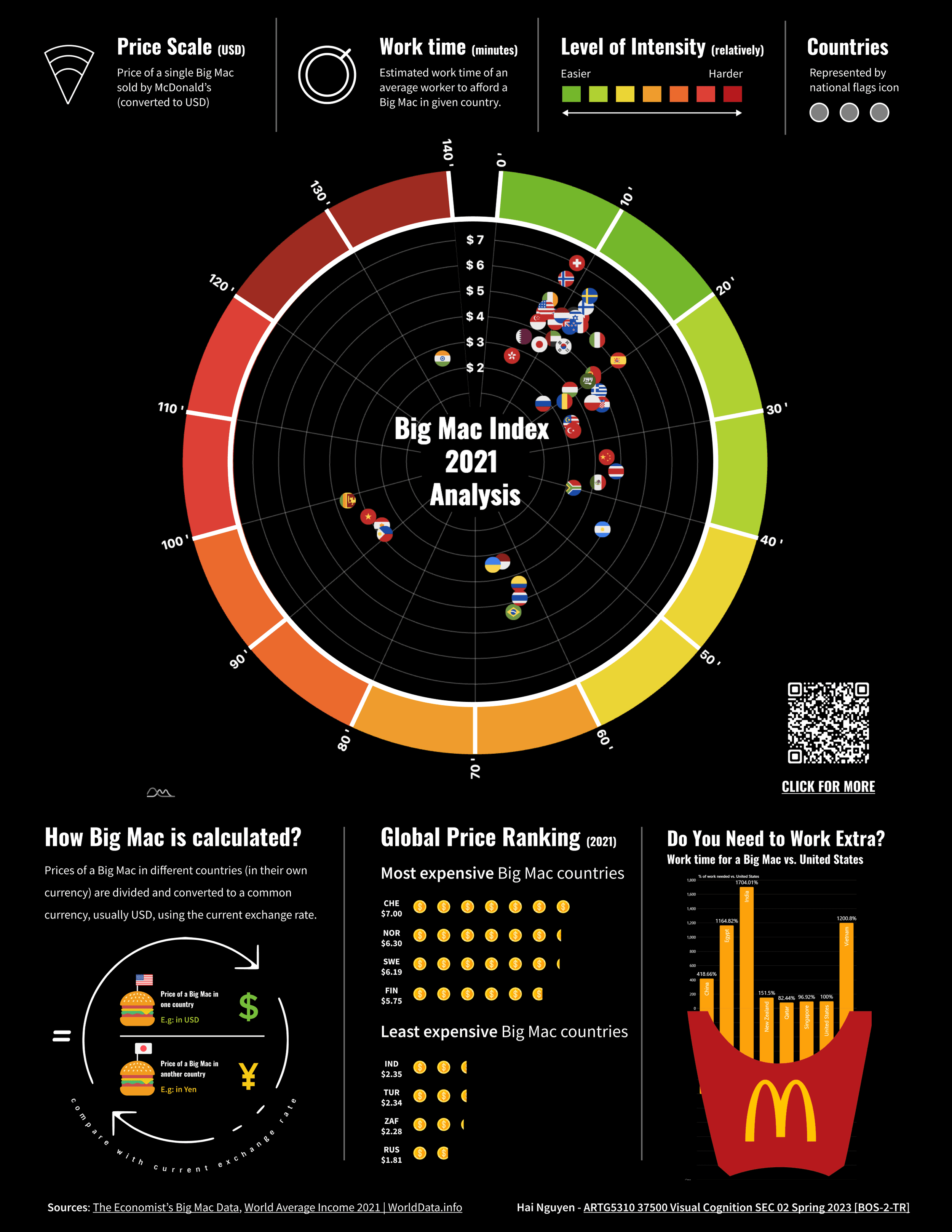
An Alternative Big Mac Index
How much time does an average worker need to afford a Big Mac in a given country?
Timeline
Aug 2023 - Dec 2023 (3 months)
Tools
JavaScript
amCharts
Figma
Team
Individual Project


It's clear that the affordability of a Big Mac doesn't only depend on its price but also on the income, expenses, and economic setting specific to one’s region.
Thinking of a solution
I aim to bring my unique perspective and creativity to the design. Utilizing our everyday materials with selective visual cues, this visualization can help people quickly grasp the overall picture of the economic circumstances around this popular fast-food item.
User Problems
While the traditional Big Mac Index compares currency purchasing power, my version translates this into a more familiar landscape by measuring how many hours of work it takes the typical person to afford a Big Mac.
User Problems
While the traditional Big Mac Index compares currency purchasing power, my version translates this into a more familiar landscape by measuring how many hours of work it takes the typical person to afford a Big Mac.
User Problems
While the traditional Big Mac Index compares currency purchasing power, my version translates this into a more familiar landscape by measuring how many hours of work it takes the typical person to afford a Big Mac.
The new Big Mac Index shows an interactive chart for further analysis.

#2: Simple and Clean UI
I aim to make the design concept easily accessible to a broader audience. This involves adopting a design approach that integrates minimal texture and grid-based elements.

#2: Simple and Clean UI
I aim to make the design concept easily accessible to a broader audience. This involves adopting a design approach that integrates minimal texture and grid-based elements.

#2: Simple and Clean UI
I aim to make the design concept easily accessible to a broader audience. This involves adopting a design approach that integrates minimal texture and grid-based elements.

#1: Tunability
The primary graph should be visually tunable and straightforward. Additionally, other visual elements like charts and labels should be easily recognizable and differentiated from each other. Gestalt's Principles (Proximity, Similarity, and Good Figure) are strongly considered for visual cohesiveness.

#3: Descriptive
While the static graph's simplistic appearance achieves a streamlined look, it comes at the cost of omitting some information. I decided to create an interactive version of this content. This especially benefits advanced users (economists and analysts) who prefer precise data.

#3: Descriptive
While the static graph's simplistic appearance achieves a streamlined look, it comes at the cost of omitting some information. I decided to create an interactive version of this content. This especially benefits advanced users (economists and analysts) who prefer precise data.

#3: Descriptive
While the static graph's simplistic appearance achieves a streamlined look, it comes at the cost of omitting some information. I decided to create an interactive version of this content. This especially benefits advanced users (economists and analysts) who prefer precise data.

#5: A11y-first
I created the a11y-first gradient color set using ColorDesigner.io to calculate a range of swatches. This method allows me to experiment with various color combinations in design and achieve a balanced palette (so that no single color stands out too prominently).
Next, I transferred the LAB palette to VIZ PALETTE and made some adjustments to improve the ability to distinguish the colors. It's important that all the colors can be adjusted, stand out well against the background, and are somewhat accessible for those with color blindness.

#4: Interactive
These interactive visuals enable me to present a more engaging narrative and throughout the story through dynamic animations. Customizations can also be made for different audience queries.

#4: Interactive
These interactive visuals enable me to present a more engaging narrative and throughout the story through dynamic animations. Customizations can also be made for different audience queries.

#4: Interactive
These interactive visuals enable me to present a more engaging narrative and throughout the story through dynamic animations. Customizations can also be made for different audience queries.

Heading Out?
Appreciate you stopping by! Don't be a stranger, let's stay in touch.
Heading Out?
Appreciate you stopping by! Don't be a stranger, let's stay in touch.
Heading Out?
Appreciate you stopping by! Don't be a stranger, let's stay in touch.